Working with colors is complex. They are a crucial element of any brand and can impact user experience, both positively and negatively. It also requires good skills to choose them appropriately; it’s not only about taste and visual balance but also about contrast and how they will be used.
During our last Cycle, we managed to update our color palette. Here is the story behind this revamp.
Why this update?
Hunter was created seven years ago, so was the first palette. Even if it evolved and improved over years, we eventually reached a point where reworking it deeply was inevitable.
Normalization
As our team is constantly growing, we need to standardize more and more our code and processes to keep a high level of quality in our product. The colors defined on our palette had to be the same as those available in our codebase, and each color had to serve a clearly defined purpose.
Accessibility
We had contrast issues with some colors. These colors had to be reworked; the goal was to fit the WCAG recommendations (level AA). This would positively impact our product global accessibility and readability.
Consistency
Enhance the visual consistency was also essential to keep a good balance on the aesthetics of our product. We wanted something that kept the brightness we had, while being contrasted enough.
The previous palette was not broad enough, so we were forced to use some random colors, using Sass color function (lighten() or darken()). This goes against a global consistency.
State of the art
Before anything else, it was essential to understand the actual situation and see what we already had, what could be improved and what should be removed. To achieve this, we did a complete color audit.
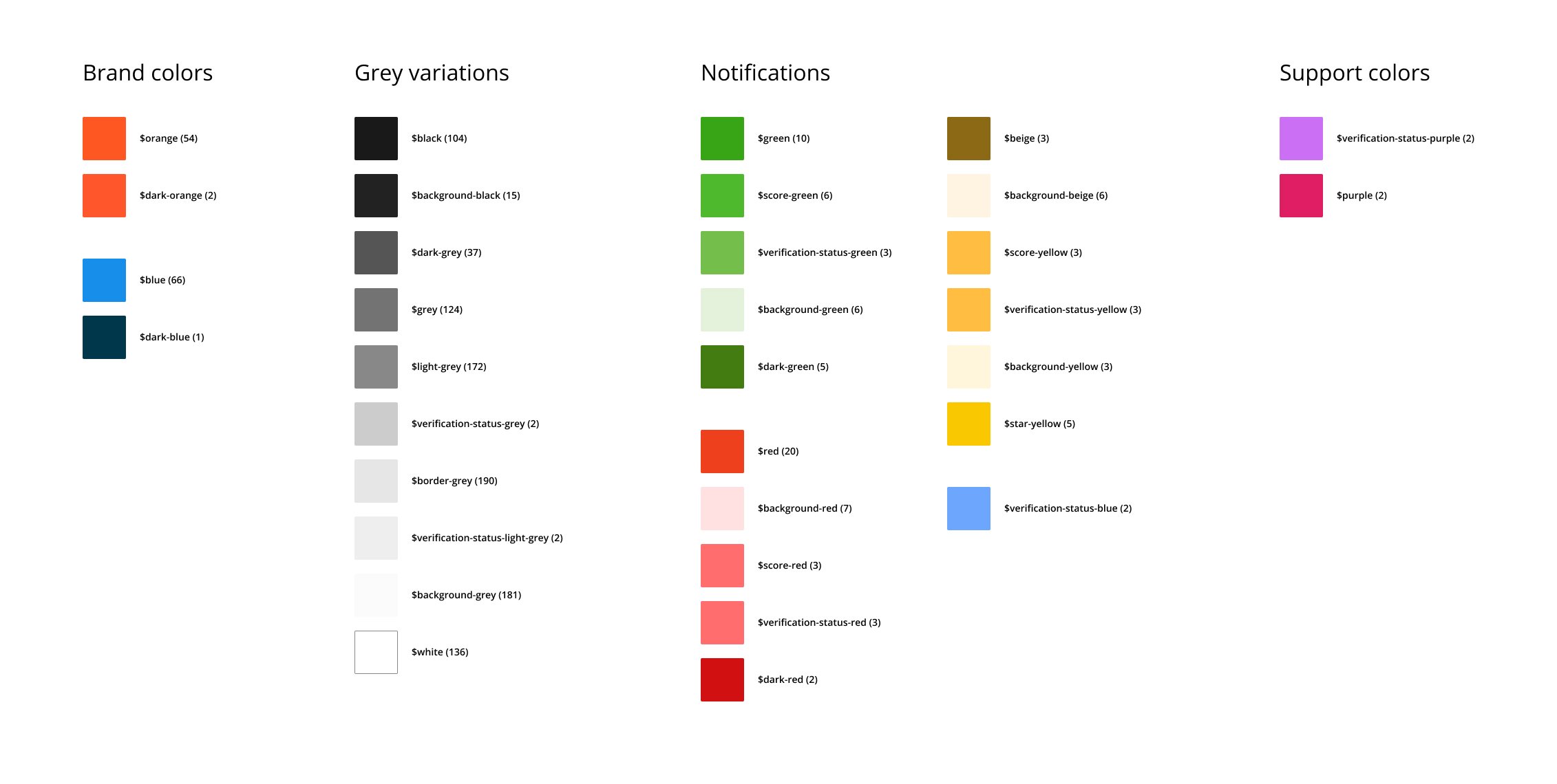
The current colors were well defined and worked well together, so we decided to keep the same palette but dust it off. We also found out some weaknesses:
- Lack of naming convention: that’s one of the most common mistakes when colors are added over time. In our case, the main issue was the non-semantic name. For example,
$background-greywas used for background color, but not only. - Unused colors: some colors defined in our palette weren’t used at all, and some others at one place only while there were some similar colors.
- Similar colors: a few colors were so close that their usage wasn’t clear enough - it was possible to use one or the other in the same case.
- Generated colors: some colors were generated using Sass color functions to compensate for the lack of a wide enough palette. Because of that, some colors were unique.
Define the new palette
With all this in our hands, we went deep into the fantastic world of colors!
Pick the right colors
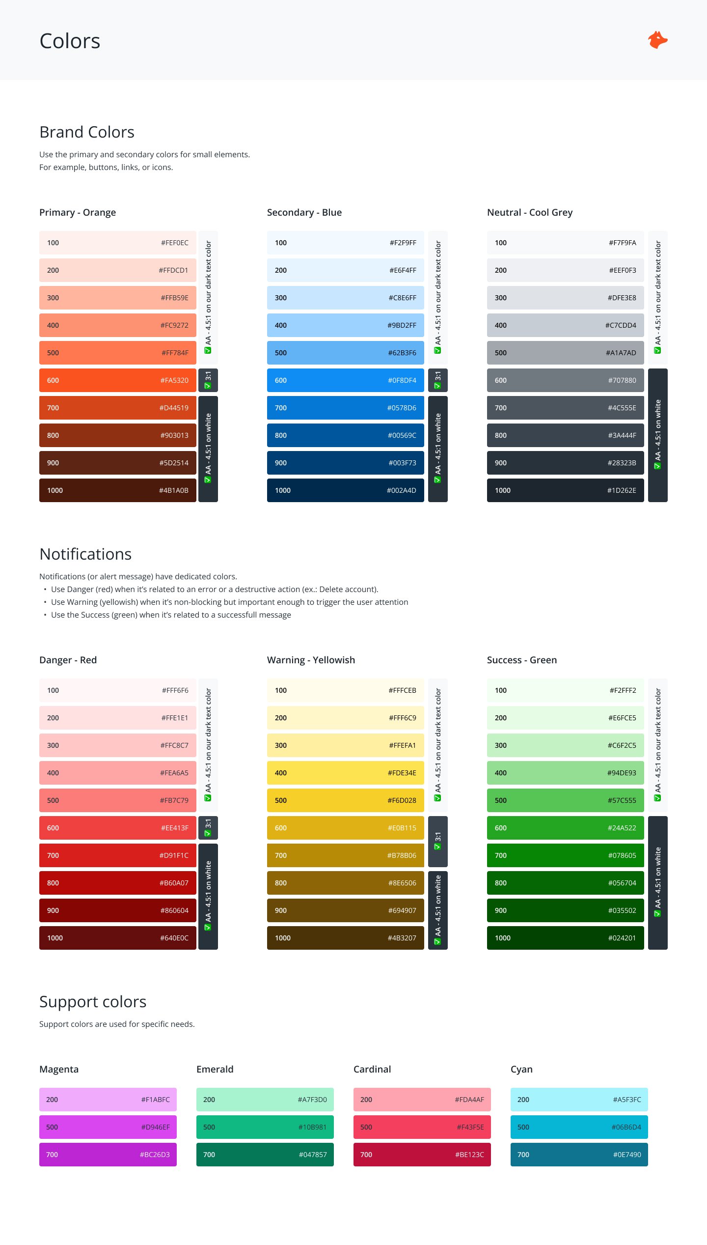
We needed to generate ten colors divided into three categories:
- Brand Colors: orange / blue / grey
- Notifications Colors: green / yellowish / red
- Support Colors: 4 colors, different from the previous ones
There is a lot of good literature about colors, and we extensivley took advantage of this. The people at Stripe, Amplitude, or Doctolib did a great job documenting their journey.
We started manually, iterating color by color to have a harmony between them. This was the only good way to have something fitting our expectations.
Once the main colors were defined, we generated the first version of each palette using colorbox.io. We tweaked each shade by hand until we were satisfied with the result, then we applied those colors to some components (buttons, alerts, tags) to see how they worked in situation. That leads us to a final iteration to bring a little bit more brightness!
Naming
Colors name was one of the pain points we identified during our audit. Having a name based on the color itself can be problematic in the long term. Choosing a more semantic approach allows it to cross the tests of time. The good ol’ orange is now our primary color. We only kept the color name for support colors as they are hard to categorize based on usage. For the shades, we used a scale from 0 to 1000 - from the lightest to the darkest color. We decided not to use the luminance value of each color - even if we calculated them to define our palette, because it seems less easy to use daily.
# Example of colors name

# Brand colors
primary-600
primary-700

secondary-100
secondary-500

# Notifications colors
success-100
success-600

danger-100
danger-600

warning-100
warning-600

# Support colors
cyan-200
cyan-500

cardinal-200
cardinal-500
Design Tokens and CSS Custom Properties
Keeping things aligned between the Design and the Development teams can be tricky. There are a lot of good practices to follow, and Design Tokens are one of them today.
Design Tokens are more and more mature (they have their own W3C Working Group), and many new tools appearead to help with managing them. We took this update as an opportunity to introduce our first tokens.
There were created in Figma, thanks to the Figma Tokens plugin, and we exported them as CSS Custom Properties in our codebase.
:root {
  /**
  * Some of our Design Tokens as CSS Custom Properties
  */

  /* Primary - Orange */
  --colors-primary-100:     #FEF0EC;
  --colors-primary-200:     #FFDCD1;
  --colors-primary-300:     #FFB59E;
  […]

  /* Secondary - Blue */
  --colors-secondary-100:   #F2F9FF;
  --colors-secondary-200:   #E6F4FF;
  --colors-secondary-300:   #C8E6FF;
  […]

  /* Neutral - Greys */
  --colors-grey-100:        #F7F9FA;
  --colors-grey-200:        #EEF0F3;
  --colors-grey-300:        #DFE3E8;
  […]
We are still using Sass, but we decided to replace Sass variables with CSS Custom Properties as they are now widely supported by the browsers. This move will make creating components (with different states) easier and might take us to introduce themes.
Conclusion
This update was an essential step in our journey towards a global standardization process. The change is not so significant visually, but it will give us more consistency and possibility for the future.